New navigation and filters for a web-based library tool.
WestEd’s Communication and Collaboration Hub for Everyone (CACHE) allows organizations to host, organize, and share resources online. In this case study, we explore the user research, design, and testing that went into its 2.0 overhaul.

About the project
The challenge
Users were finding the library difficult to navigate. Specifically, we received feedback that
- Topics and sub-topics were unclear at first glance
- Users couldn’t see , understand, and clear topic filters
- There was no clear way to go “back” or “reset” from a topic, detail page, or search.
My role
My project manager and I researched common user patterns for navigating and filtering large category-based sites, primarily e-commerce.
After using Sketch to create mid-fidelity wireframes, I created a clickable prototype in InVision.
Together, my project manager and I conducted user testing to determine what worked and what didn’t.
I then used Sketch to create mockups from which front- and back-end developers implemented the new design.
The results
Feedback indicated that users found the new topic navigation and filtering options easy to find and intuitive to use.
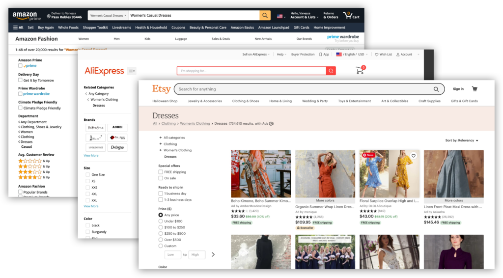
Research
Finding other resource libraries like CACHE proved difficult, so we turned to another platform with which users would be familiar — e-commerce websites. These platforms were similar in that they
- offered the user many choices organized by category
- had filters that allowed the user to refine their search
We found that such sites generally displayed category structure via breadcrumbs or in the left-hand column along with filters. Selected filters were indicated with checkboxes in the vertical sidebar and tags horizontally across the top of the results.